Maximum Drawdown: A Practical Approach with Python
1: The Importance of Maximum Drawdown
1.1 Significance of Maximum Drawdown
Maximum Drawdown (MDD) is a critical risk metric for investors. It quantifies the largest peak-to-trough decline in an investment’s value over a specified period, providing insights into potential losses during market downturns. Understanding MDD helps investors gauge the risk profile of their investments and make informed decisions.
1.2 Contextualizing MDD in Financial Analysis
In today’s volatile markets, comprehending the MDD of assets like QQQ (a NASDAQ ETF) and SPY (a S&P 500 ETF) can bring some help in grasping the risk of a particular asset. Such analysis provides a comparative view of the resilience of individual stocks versus market indices, aiding in better portfolio management.

1.3 Objective
This blog aims to introduce Python enthusiasts and portfolio managers to the concept of Maximum Drawdown, demonstrating how to calculate and visualize it using Python libraries like pandas, yfinance, and matplotlib.
2: Deriving and Understanding Maximum Drawdown
2.1 The MDD Formula
The formula to calculate Maximum Drawdown is:
Where:
- P_{peak} is the highest portfolio value during the analysis period.
- P_{trough} is the lowest portfolio value following that peak before a new peak is achieved.
2.2 Key Benefits of MDD
- Risk Assessment: Provides a clear numerical representation of potential losses during downturns.
- Portfolio Management: Helps in asset allocation and risk management.
- Performance Comparison: Facilitates comparisons between different investments.
- Emotional Preparedness: Reduces panic selling by setting realistic expectations.
2.3 Limitations of MDD
- Time Frame Dependency
- Ignores Recovery
- Does Not Capture Volatility
- Historical Data Reflection
3: Visualizing Maximum Drawdown
3.1 Line Chart of Daily Closing Prices
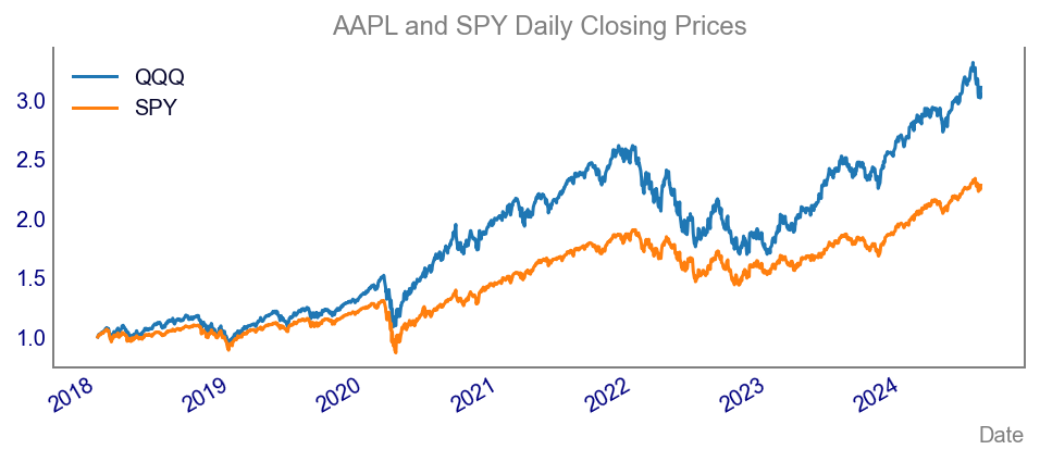
When diving into the concept of maximum drawdown, it’s essential to start with the basics and ensure you’re on solid ground. First off, gathering and plotting financial data is the backbone of any credible analysis. By doing so, you avoid the classic pitfalls of using incorrect tickers or dodgy datasets, which can completely skew your findings. Trust me, there’s nothing worse than realising your conclusions are based on faulty data. Proper data handling also helps you spot trends and anomalies right from the start, making your analysis more robust. Plus, it builds a strong foundation for any advanced techniques you want to explore later on. So, take your time, get the basics right, and your insights will be all the more valuable and reliable for it.
3.2 Waterfall Chart for Drawdown Timeline
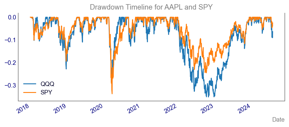
Before diving into the chart, let’s break down the calculation of maximum drawdown. Maximum drawdown measures the largest single drop from peak to trough in the value of a financial asset before a new peak is achieved.
As mentioned above, to calculate it, we track the highest point of the asset’s value over a given period and compare it to the lowest point that follows. By doing this, we get a clear picture of the worst-case scenario in terms of losses. In the chart below, we’ve illustrated the maximum drawdown to visually capture these significant drops, providing a tangible sense of the risk involved.
4: Conclusion
Practical Application
Investors and portfolio managers use Maximum Drawdown to assess risk, manage portfolios, and compare investment performance. While useful, it should be combined with other metrics for comprehensive risk management.
Explore More
Feel free to explore and test the code snippets provided. Check out the corresponding video on the Data Driven Minutes Youtube channel for a step-by-step guide.
Thanks for popping by and see you in the next article!
Vincent

